CSS: Quick and easy toggle switch control
A switch is a user interactive control with an on/off state that is commonly seen on mobile applications. They seem to have been based on the mechanical toggle switch. I’m a big fan of tactile mechanical switches but I digress.
When switching back and forth (pun intended) between developing on Xamarin.Forms and web sites, I’ve found that I much prefer the switch to a checkbox.
I’ve found a number of solutions to a switch online but most feel like they’re overly complicated. This is my implementation of a switch for websites (with Bootstrap 3 colours).
Let’s get started.
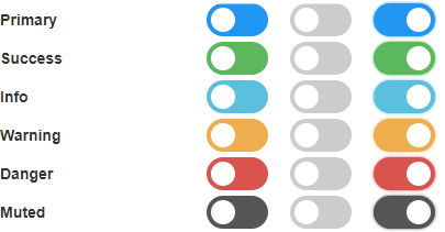
0. Preview
This is a preview of the CSS. I forgot to label the columns but they are from left-to-right:
- Coloured-off
- Off
- coloured-on
You can mix the colours for when it is off and when it’s on. There is a “glow” when it is on.
1. Usage
The layout for the HTML is as below. Replace the switch-primary with the colour you wish to use.
Please note: the id of the checkbox-input.
<label class="switch switch-primary">
    <input id="switch1" type="checkbox" />
    <span class="switch-slider"></span>
</label>
| Colour | Class (when off) | Class (when on) | |
|---|---|---|---|
| Primary | switch-off-primary | switch-primary | |
| Success | switch-off-success | switch-success | |
| Info | switch-off-info | switch-info | |
| Warning | switch-off-warning | switch-warning | |
| Danger | switch-off-danger | switch-danger | |
| Muted | switch-off-muted | switch-muted |
2. Source Code
Well, that’s it from me.
I hope someone finds this interesting or useful.
Social Media
Categories
Tags
Post Information
Posted on Thu 6th Feb 2020
Modified on Sat 5th Aug 2023